
How should an advisory firm make a chart understandable without relying on the image?
Explain an educational chart through text and a readable table. Keep its purpose, units and limitations available without relying on the picture.


Make an educational chart understandable without its image by giving it a short identifying description, an adjacent explanation of its essential meaning and a data table when values matter. The reader should be able to understand the point, units, scope and limitations without reconstructing the picture. Keep the chart and its text equivalent together when either changes.
This is an editorial worksheet for one educational chart, not an accessibility audit or a compliance guarantee. The example uses invented counts of educational resources. It contains no investment returns, client results or observed firm data. Its purpose is to show how an image, explanation and table can describe the same information.
What information does the image carry?
Start by listing the information a reader gets from the chart: its subject, categories, values, units, comparison and relevant limits. A bar chart may show which category is larger. A diagram may show sequence rather than quantity. The needed explanation follows that purpose, not the number of shapes in the image.
W3C's complex-images tutorial describes a two-part alternative for complex images: a short description identifying the image and a long description representing its essential information. It gives examples using headings, text and tables. Use that guidance to plan the explanation rather than treating a long alt attribute as the only available place for every detail.
The tutorial also notes that composition can matter. If the sequence or relative arrangement is necessary to understand the point, explain it. If a color identifies a category, name the category in text. A reader should not have to see a particular shade to discover what the chart means.
This article does not decide whether every image on a site is decorative, informative or complex. That needs a review of the image's actual role. Here the subject is a chart containing information a reader needs.
A neutral worked example
Suppose an educational page uses a chart to compare three invented resource collections. Collection A contains four guides, Collection B contains six and Collection C contains two. These counts are illustrative, not observations. They say nothing about quality, popularity or which collection a person should choose.
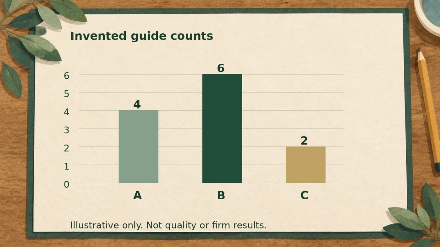
Full text description of the example chart
The chart compares the number of guides in three fictional collections. Collection B has six guides, Collection A has four and Collection C has two. B has the largest count and C the smallest. The bars start at zero and use the same count scale. The chart describes quantity only; it does not compare the guides' usefulness or quality.
| Collection | Number of guides | Scope |
|---|---|---|
| A | 4 | Illustrative count, not observed data. |
| B | 6 | Illustrative count, not observed data. |
| C | 2 | Illustrative count, not observed data. |
The adjacent paragraph carries the comparison and limitation. The table carries exact values and units. The image is another presentation of the information, not its sole source. If the chart were unavailable, a reader would still have the point and the underlying values.
What should the short description say?
Use the short description to identify the chart and its purpose. When the full explanation appears nearby, the short description can point there. In this example, it says the chart compares invented counts of guides and that the description and values follow. It does not attempt to compress the entire table and interpretation into one sentence.
A phrase such as "chart image" does not identify the comparison. A statement such as "Collection B is best" adds a conclusion the counts cannot establish. Name what is shown without adding a recommendation. Short does not mean vague, and descriptive does not mean persuasive.
Keep the reference to the explanation accurate. If the explanation moves below a section or behind a link, recheck the wording and route. Saying "described below" cannot fix a missing description. The actual page needs to make the text easy to find.
What belongs in the full explanation?
Describe the essential relationships in a reading order that makes sense. For a comparison chart, identify the categories, the units, the direction of the comparison and any caveat that changes its meaning. For a process diagram, explain the starting point, decisions and branches. Avoid describing every visual detail when it adds no information.
Do not leave a crucial limitation inside the image alone. The invented-data label in this example appears in the introductory prose, caption, full explanation and table scope. That repetition keeps the limitation with each route through the content. It is not evidence that the chart represents a real firm.
Use concrete nouns rather than references such as "the green one" or "the left bar." A reader of the paragraph should know that Collection B has six guides without opening the image. Color and position can support the image, but they should not replace the category names.
When does a table help?
A table is useful when the exact values matter to the explanation. Give it a title or caption, clear headers and units. Keep each value paired with the category it describes. A column headed "number" is less useful than "number of guides" because the unit is part of the meaning.
A table of values alone may still omit the point. In the example, the table says four, six and two; the adjacent explanation states which collection has the largest count and that quantity is not quality. Give the reader both rather than assuming they will infer the intended comparison.
Do not invent a data table for a qualitative image that contains no numerical values. A decision diagram may need a structured list of steps and branches instead. Choose the text form that preserves the information rather than forcing every picture into the same template.

A chart-equivalent worksheet
The worksheet below concerns one image and its nonvisual explanation. It is not a general claim ledger or an article-maintenance decision.
| Part | Question to answer | Example check |
|---|---|---|
| Purpose | What comparison or decision does the chart explain? | Counts of guides in fictional collections, not quality. |
| Short description | Does it identify the image and locate the full explanation? | Names the comparison and says values follow. |
| Full explanation | Are essential relationships and limits available in text? | B is largest; C is smallest; counts are illustrative. |
| Data table | Can a reader find the exact categories, values and units? | A4, B6, C2, with guide-count header. |
| Revision | Did the image and all text equivalents change together? | Recheck the paragraph and table after a value changes. |
The claim-review ledger asks whether evidence supports a statement. It does not substitute for explaining a chart without its image. The article-maintenance guide considers the broader page decision. Here the narrow task is to preserve a chart's essential information across its image and text.
How should the actual page be checked?
Read the explanation and table without relying on the chart. Can the reader identify the subject, units, comparison and limits? Then compare those words with the actual image. A correct paragraph beside a different chart still leaves the page inconsistent.
Inspect desktop and mobile presentation. Check that the description remains adjacent, the table headings are meaningful and the values stay connected to their categories. These checks do not certify the whole page or site. They establish what the reviewer inspected and which problems remain.
Finally, give the image and its equivalents one revision owner. A changed chart needs a check of the short description, full explanation, table and limits together. The useful result is a reader who can understand the information through text, not a file marked complete because an alt field contains something.
Frequently asked questions
Is this an accessibility-compliance guarantee?
No. It is an editorial worksheet for one chart, not an audit or certification of a page or site.
Are the example chart values real firm results?
No. They are invented guide counts in fictional collections, labeled illustrative throughout.
Does short alt text replace a full explanation?
Not for this complex chart. The short description identifies it; adjacent text and the table provide its essential information.
Does every image need a numerical table?
No. A qualitative diagram may need a structured explanation of steps or branches rather than invented values.
What should change when the chart changes?
Review the image, short description, full explanation, table and limitations together.